`charts.css.py` brings `charts.css` to Python. Online documentation and samples is available at the link below.

Overview

charts.css.py

charts.css.py provides a python API to convert your 2-dimension data lists into html snippet, which will be rendered into charts by CSS, when serving inside a browser.

  • The output of charts.css.py is not images. Consequently, charts.css.py is a pure Python package without any image library dependency. You can use charts.css.py on any platform.
  • The output of charts.css.py is a normal HTML table. Search engines and screen readers will be able to consume your data even when CSS rendering is unavailable.
  • Once the html snippet is delivered into the browser window, the rendering is done by CSS, which is typically faster than JS-heavy chart libraries.
  • Since the output is normal HTML, you could customize its size and position, by defining your own CSS styles.

Installation

pip install charts.css.py

Usage

Just combine the output of charts.css.py functions and the predefined CSS style <link rel="stylesheet" href="https://cdn.jsdelivr.net/npm/charts.css/dist/charts.min.css"> into your html page.

For example, the following code snippet can convert a 2-dimension list into column chart:

from charts.css import column
STYLESHEET = '<link rel="stylesheet" href="https://cdn.jsdelivr.net/npm/charts.css/dist/charts.min.css">'
chart = column(
    [
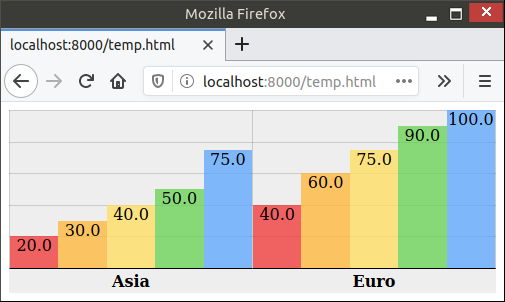
        ["Continent", "1st year", "2nd year", "3rd year", "4th year", "5th year"],
        ["Asia", 20.0, 30.0, 40.0, 50.0, 75.0],
        ["Euro", 40.0, 60.0, 75.0, 90.0, 100.0],
    ],
    headers_in_first_row=True,
    headers_in_first_column=True,
    )
# Now, variable chart contains html snippet of "<table>...</table>", and
# STYLESHEET is just a constant string of "<link href='https://.../charts.css'>".
# You can somehow insert them into the proper places of your full html page.
# Here in this sample, we take a shortcut by simply concatenating them.
open("output.html", "w").write(STYLESHEET + chart)

The output.html will be rendered in browser like this:

Sample output

Advanced Usage

There are currently 4 different charts implemented: bar, column, line, area. All those methods support many parameters to further customize the chart appearance. bar() and column() also support stacking by value or stacking by percentage. All those features are demonstrated in the different samples in this document.

Lastly, this package also provides a command-line tool csv2chart. You can use it to convert csv file into an html file. For example, csv2chart sample.csv output.html. You can also run csv2chart -h to know all the parameters it supports.

Versioning

charts.css.py uses Semantic Versioning.

You might also like...
🐞 📊 Ladybug extension to generate 2D charts

ladybug-charts Ladybug extension to generate 2D charts. Installation pip install ladybug-charts QuickStart import ladybug_charts API Documentation Loc

GitHub English Top Charts

Help you discover excellent English projects and get rid of the interference of other spoken language.

Data-FX is an addon for Blender (2.9) that allows for the visualization of data with different charts

Data-FX Data-FX is an addon for Blender (2.9) that allows for the visualization of data with different charts Currently, there are only 2 chart option

Glue is a python project to link visualizations of scientific datasets across many files.

Glue Glue is a python project to link visualizations of scientific datasets across many files. Click on the image for a quick demo: Features Interacti

Flipper Zero documentation repo

Flipper Zero Docs Participation To fix a bug or add something new to this repository, you need to open a pull-request. Also, on every page of the site

A tool for automatically generating 3D printable STLs from freely available lidar scan data.

mini-map-maker A tool for automatically generating 3D printable STLs from freely available lidar scan data. Screenshots Tutorial To use this script, g

A Python Binder that merge 2 files with any extension by creating a new python file and compiling it to exe which runs both payloads.

Update ! ANONFILE MIGHT NOT WORK ! About A Python Binder that merge 2 files with any extension by creating a new python file and compiling it to exe w

Debugging, monitoring and visualization for Python Machine Learning and Data Science

Welcome to TensorWatch TensorWatch is a debugging and visualization tool designed for data science, deep learning and reinforcement learning from Micr

Python module for drawing and rendering beautiful atoms and molecules using Blender.

Batoms is a Python package for editing and rendering atoms and molecules objects using blender. A Python interface that allows for automating workflows.

Comments
  • charts.css.py 0.4.0

    charts.css.py 0.4.0

    This release adds some helper and parameters to help you fine tune the chart appearance. They are especially useful when you attempt to render some csv data input with many rows.

    • Feature: A transpose(...) helper to flip your input data diagonally so that it swaps its x-axis and y-axis.
    • Feature: New parameter hide_label. It is useful when primary axis contains too many rows.
    • Feature: New parameter tooltip_builder which has a shape of lambda value="...", label="...": "...".
    • Feature: New parameter value_converter which typically will be assigned with either int or float.
    • Change: By default, data axes will no longer be shown. You can turn it back on by the new show_data_axes parameter.

    The online documentation will be updated to demonstrate these new features.

    opened by rayluo 0
  • Release 0.3.0

    Release 0.3.0

    • Line chart should not accept non-zero data_spacing or datasets_spacing. Now it would rightfully reject such an input.
    • Provide an online document/sample
    • Backport to Brython 3.7 and 3.8. The recommended Brython version is still its latest version, currently 3.9.
    opened by rayluo 0
  • charts.css.py 0.1.0

    charts.css.py 0.1.0

    The first release contains:

    • Basic functionality including bar, column, line and area
    • An experimental helper wrapper
    • Barely enough documentation in README.md
    • Also comes with a command-line tool csv2chart. I use it for my ad-hoc test. Let me know if you find it useful.
    opened by rayluo 0
Releases(0.4.0)
  • 0.4.0(Jun 27, 2021)

    This release adds some helper and parameters to help you fine tune the chart appearance. They are especially useful when you attempt to render some csv data input with many rows.

    • Feature: A transpose(...) helper to flip your input data diagonally so that it swaps its x-axis and y-axis.
    • Feature: New parameter value_converter which typically will be assigned with either int or float. With its help, now you can consume data directly from csv by data = list(csv.reader(f)).
    • Feature: New parameter hide_label. It is useful when primary axis contains too many rows.
    • Feature: New parameter tooltip_builder which has a shape of lambda value="...", label="...": "...".
    • Change: By default, data axes will no longer be shown. You can turn it back on by the new show_data_axes parameter.

    The online documentation ~will be~ has been updated to demonstrate these new features.

    Source code(tar.gz)
    Source code(zip)
    charts.css.py-brython.js(8.11 KB)
  • 0.3.0(May 23, 2021)

    • Line chart should not accept non-zero data_spacing or datasets_spacing. Now it would rightfully reject such an input.
    • Provide an online document/sample
    • Backport to Brython 3.7 and 3.8. The recommended Brython version is still its latest version, currently 3.9.
    • Also hosted as a Brython package which can be used by <script src="https://github.com/rayluo/charts.css.py/releases/download/0.3.0/charts.css.py-brython.js"></script>. Requires Brython 3.7.5 or above.
    Source code(tar.gz)
    Source code(zip)
    charts.css.py-brython.js(7.20 KB)
  • 0.2.0(May 17, 2021)

  • 0.1.0(May 14, 2021)

    The first release contains:

    • Basic functionality including bar, column, line and area
    • An experimental helper wrapper
    • Barely enough documentation in README.md
    • Also comes with a command-line tool csv2chart. I use it for my ad-hoc test. Let me know if you find it useful.
    Source code(tar.gz)
    Source code(zip)
Glue is a python project to link visualizations of scientific datasets across many files.

Glue Glue is a python project to link visualizations of scientific datasets across many files. Click on the image for a quick demo: Features Interacti

675 Dec 09, 2022
A command line tool for visualizing CSV/spreadsheet-like data

PerfPlotter Read data from CSV files using pandas and generate interactive plots using bokeh, which can then be embedded into HTML pages and served by

Gino Mempin 0 Jun 25, 2022
Visualization Data Drug in thailand during 2014 to 2020

Visualization Data Drug in thailand during 2014 to 2020 Data sorce from ข้อมูลเปิดภาครัฐ สำนักงาน ป.ป.ส Inttroducing program Using tkinter module for

Narongkorn 1 Jan 05, 2022
Typical: Fast, simple, & correct data-validation using Python 3 typing.

typical: Python's Typing Toolkit Introduction Typical is a library devoted to runtime analysis, inference, validation, and enforcement of Python types

Sean 171 Jan 02, 2023
nvitop, an interactive NVIDIA-GPU process viewer, the one-stop solution for GPU process management

An interactive NVIDIA-GPU process viewer, the one-stop solution for GPU process management.

Xuehai Pan 1.3k Jan 02, 2023
Visualizations of linear algebra algorithms for people who want a deep understanding

Visualising algorithms on symmetric matrices Examples QR algorithm and LR algorithm Here, we have a GIF animation of an interactive visualisation of t

ogogmad 3 May 05, 2022
CLAHE Contrast Limited Adaptive Histogram Equalization

A simple code to process images using contrast limited adaptive histogram equalization. Image processing is becoming a major part of data processig.

Happy N. Monday 4 May 18, 2022
Design your own matplotlib stylefile interactively

Tired of playing with font sizes and other matplotlib parameters every time you start a new project or write a new plotting function? Want all you plots have the same style? Use matplotlib configurat

yobi byte 207 Dec 08, 2022
Gallery of applications built using bqplot and widget libraries like ipywidgets, ipydatagrid etc.

bqplot Gallery This is a gallery of bqplot examples. View the gallery at https://bqplot.github.io/bqplot-gallery. Contributing new examples Clone this

8 Aug 23, 2022
This plugin plots the time you spent on a tag as a histogram.

This plugin plots the time you spent on a tag as a histogram.

Tom Dörr 7 Sep 09, 2022
HW 02 for CS40 - matplotlib practice

HW 02 for CS40 - matplotlib practice project instructions https://github.com/mikeizbicki/cmc-csci040/tree/2021fall/hw_02 Drake Lyric Analysis Bar Char

13 Oct 27, 2021
Easily convert matplotlib plots from Python into interactive Leaflet web maps.

mplleaflet mplleaflet is a Python library that converts a matplotlib plot into a webpage containing a pannable, zoomable Leaflet map. It can also embe

Jacob Wasserman 502 Dec 28, 2022
Visualization Website by using Dash and Heroku

Visualization Website by using Dash and Heroku You can visit the website https://payroll-expense-analysis.herokuapp.com/ In this project, I am interes

YF Liu 1 Jan 14, 2022
Python package for the analysis and visualisation of finite-difference fields.

discretisedfield Marijan Beg1,2, Martin Lang2, Samuel Holt3, Ryan A. Pepper4, Hans Fangohr2,5,6 1 Department of Earth Science and Engineering, Imperia

ubermag 12 Dec 14, 2022
3D rendered visualization of the austrian monuments registry

Visualization of the Austrian Monuments Visualization of the monument landscape of the austrian monuments registry (Bundesdenkmalamt Denkmalverzeichni

Nikolai Janakiev 3 Oct 24, 2019
Import, visualize, and analyze SpiderFoot OSINT data in Neo4j, a graph database

SpiderFoot Neo4j Tools Import, visualize, and analyze SpiderFoot OSINT data in Neo4j, a graph database Step 1: Installation NOTE: This installs the sf

Black Lantern Security 42 Dec 26, 2022
Automatic data visualization in atom with the nteract data-explorer

Data Explorer Interactively explore your data directly in atom with hydrogen! The nteract data-explorer provides automatic data visualization, so you

Ben Russert 65 Dec 01, 2022
A Scheil-Gulliver simulation tool using pycalphad.

scheil A Scheil-Gulliver simulation tool using pycalphad. import matplotlib.pyplot as plt from pycalphad import Database, variables as v from scheil i

pycalphad 6 Dec 10, 2021
Lightweight data validation and adaptation Python library.

Valideer Lightweight data validation and adaptation library for Python. At a Glance: Supports both validation (check if a value is valid) and adaptati

Podio 258 Nov 22, 2022
Manim is an animation engine for explanatory math videos.

A community-maintained Python framework for creating mathematical animations.

12.4k Dec 30, 2022