PyG2Plot
🎨 Python3 binding for@AntV/G2Plotwhich an interactive and responsive charting library. Based on the grammar of graphics, you can easily make superior statistical charts through a few lines of code.PyG2Plotis inspired by pyecharts.

![]()

Document: 中文说明文档 · Drawing statistical plots · In Jupyter Notebook · Principles
Installation
$ pip install pyg2plot
Usage
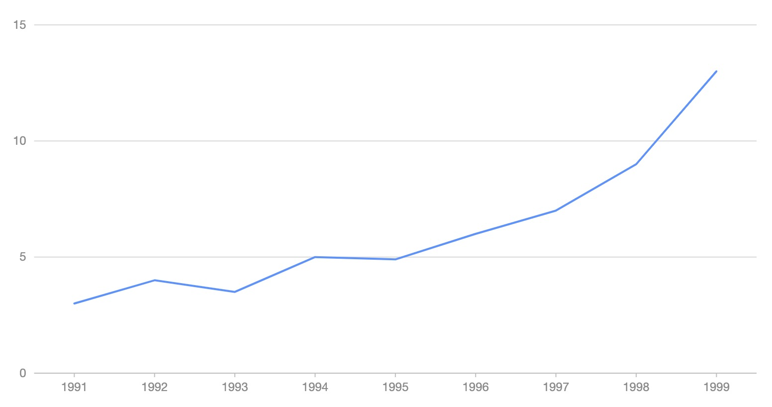
render HTML
from pyg2plot import Plot

line = Plot("Line")

line.set_options({
  "data": [
    { "year": "1991", "value": 3 },
    { "year": "1992", "value": 4 },
    { "year": "1993", "value": 3.5 },
    { "year": "1994", "value": 5 },
    { "year": "1995", "value": 4.9 },
    { "year": "1996", "value": 6 },
    { "year": "1997", "value": 7 },
    { "year": "1998", "value": 9 },
    { "year": "1999", "value": 13 },
  ],
  "xField": "year",
  "yField": "value",
})

# 1. render html file
line.render("plot.html")
# 2. render html string
line.render_html()
render Jupyter
from pyg2plot import Plot

line = Plot("Line")

line.set_options({
  "height": 400, # set a default height in jupyter preview
  "data": [
    { "year": "1991", "value": 3 },
    { "year": "1992", "value": 4 },
    { "year": "1993", "value": 3.5 },
    { "year": "1994", "value": 5 },
    { "year": "1995", "value": 4.9 },
    { "year": "1996", "value": 6 },
    { "year": "1997", "value": 7 },
    { "year": "1998", "value": 9 },
    { "year": "1999", "value": 13 },
  ],
  "xField": "year",
  "yField": "value",
})

# 1. render in notebook
line.render_notebook()

# 2. render in jupyter lab
line.render_jupyter_lab()
API
Now, only has one API of pyg2plot.
- Plot
-
Plot(plot_type: str): get an instance of
Plotclass. -
plot.set_options(options: object): set the options of G2Plot into instance.
-
plot.render(path, env, **kwargs): render out html file by setting the path, jinja2 env and kwargs.
-
plot.render_notebook(env, **kwargs): render plot on jupyter preview.
-
plot.render_html(env, **kwargs): render out html string by setting jinja2 env and kwargs.
-
plot.dump_js_options(env, **kwargs): dump js options by setting jinja2 env and kwargs, use it for HTTP request.
More apis is on the way.
License
MIT@hustcc.

 8 Dec 14, 2022
 432 Dec 30, 2022
 1 Jan 06, 2022
 1 Sep 01, 2022
 102 Dec 24, 2022
 16 Dec 17, 2022
 27 Sep 03, 2022
 1 Dec 21, 2021
 3.3k Dec 27, 2022
 5 Nov 07, 2022
 10 Jul 19, 2022
 90 Dec 14, 2022
 5 Nov 09, 2022
 6 Apr 09, 2022
 32 Dec 13, 2022
 207 Jan 01, 2023
 6 Dec 10, 2021
 124 Jan 07, 2023
 73 Oct 02, 2022
 171 Jan 02, 2023