termplotlib


termplotlib is a Python library for all your terminal plotting needs. It aims to work like matplotlib.
Line plots
For line plots, termplotlib relies on gnuplot. With that installed, the code
import termplotlib as tpl
import numpy as np

x = np.linspace(0, 2 * np.pi, 10)
y = np.sin(x)

fig = tpl.figure()
fig.plot(x, y, label="data", width=50, height=15)
fig.show()
produces
    1 +---------------------------------------+
  0.8 |    **     **                          |
  0.6 |   *         **           data ******* |
  0.4 | **                                    |
  0.2 |*              **                      |
    0 |                 **                    |
      |                                   *   |
 -0.2 |                   **            **    |
 -0.4 |                     **         *      |
 -0.6 |                              **       |
 -0.8 |                       **** **         |
   -1 +---------------------------------------+
      0     1    2     3     4     5    6     7
Horizontal histograms
import termplotlib as tpl
import numpy as np

rng = np.random.default_rng(123)
sample = rng.standard_normal(size=1000)
counts, bin_edges = np.histogram(sample)

fig = tpl.figure()
fig.hist(counts, bin_edges, orientation="horizontal", force_ascii=False)
fig.show()
produces
Horizontal bar charts are covered as well. This
import termplotlib as tpl

fig = tpl.figure()
fig.barh([3, 10, 5, 2], ["Cats", "Dogs", "Cows", "Geese"], force_ascii=True)
fig.show()
produces
Cats   [ 3]  ************
Dogs   [10]  ****************************************
Cows   [ 5]  ********************
Geese  [ 2]  ********
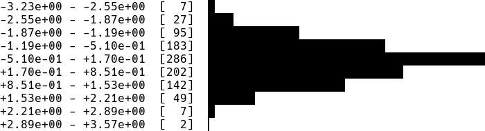
Vertical histograms
import termplotlib as tpl
import numpy as np

rng = np.random.default_rng(123)
sample = rng.standard_normal(size=1000)
counts, bin_edges = np.histogram(sample, bins=40)
fig = tpl.figure()
fig.hist(counts, bin_edges, grid=[15, 25], force_ascii=False)
fig.show()
produces

Tables
Support for tables has moved over to termtables.
Installation
termplotlib is available from the Python Package Index, so simply do
pip install termplotlib
to install.
Testing
To run the termplotlib unit tests, check out this repository and type
pytest
![width = max([len(line) for c in self._content for line in c]) No content in figure](https://avatars.githubusercontent.com/u/33210026?v=4)


![FileNotFoundError: [WinError 2] The system cannot find the file specified](https://avatars.githubusercontent.com/u/967771?v=4)
![[Question] GPL License](https://avatars.githubusercontent.com/u/112847?v=4)
![FileNotFoundError: [WinError 2] The system cannot find the file specified](https://avatars.githubusercontent.com/u/20307166?v=4)


 3 Dec 13, 2022
 529 Jan 02, 2023
 28 Dec 14, 2022
 3.3k Jan 01, 2023
 258 Nov 22, 2022
 2 Oct 19, 2022
 56 Dec 30, 2022
 10 Jun 01, 2022
 504 Dec 23, 2022
 122 Dec 21, 2022
 6 Mar 10, 2022
 1.1k Jan 05, 2023
 21 Nov 20, 2022
 31 Dec 15, 2022
 2.9k Dec 27, 2022
 16 Dec 17, 2022
 5 Feb 06, 2022
 12 Nov 07, 2022
 2k Jan 05, 2023