![]()

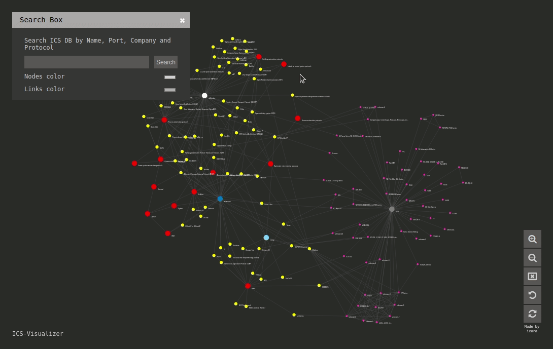
ICS-Visualizer is an interactive Industrial Control Systems (ICS) network graph that contains up-to-date ICS metadata (Name, company, port, user manuals, external links, and mapped wireshark\namp modules and scripts).
Interface
Live
https://qeeqbox.github.io/ics-visualizer/
Features
- ICS metadata (Name, company, port and info)
- Mapped Wireshark and NMAP modules\scripts
- External links to great ICS resources (Articles, manuals and projects)
- Optimized canvas (Fast interaction)
- Search function (Target item will be highlighted)
- Zoom-in, zoom-out & reset options
Notes
- ICS metadata db was compiled using my previous experience with ICS and a lot of great external articles\researches\projects (Do not forget to check them out!)
Resources
d3js.org wikipedia wireshark nmap and more
Other Licenses
By using this framework, you are accepting the license terms of each package listed below: D3, fontawesome, jQuery & JavaScript
Other Projects


 280 Dec 19, 2022
 73 Oct 02, 2022
 11 Oct 26, 2021
 249 Jan 06, 2023
 6 Oct 19, 2021
 68 Aug 18, 2022
 1 Dec 20, 2021
 2 Dec 15, 2021
 12 Nov 07, 2022
 3 May 05, 2022
 1 Jan 10, 2022
 473 Dec 12, 2022
 4 Oct 10, 2022
 49.9k Jan 02, 2023
 611 Dec 29, 2022
 1 Jan 11, 2022
 36 Dec 21, 2022
 83 Nov 26, 2022
 719 Jan 04, 2023
 38 Dec 20, 2022