HM02: Visualizing Interesting Datasets

Overview

HM02: Visualizing Interesting Datasets

This is a homework assignment for CSCI 40 class at Claremont McKenna College. Go to the project page to learn more!

Graph 1. Frequency of Nobel Prize Award in 15 Countries

Graph1
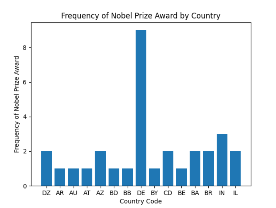
Graph 1 compares the frequency of Nobel Prizes awarded to different countries. Each country code represents a country. Among the 15 countries selected, Bavaria (DE) had nine individuals been awarded Nobel Prize. Check out other countries in this data set if you are interested!

Graph 2. Number of On-time and Delayed Flights in the US from 2003 to 2016

Graph2
Graph 2 compares the number of on-time and delayed flights in the US from 2003 to 2016. The dataset used to create this graph included all major US airports. Based on this graph, we see that the difference between the number of on-time and delayed flights stayed consistent over the years, except for the year 2003 and 2016. If you are interested in about this, you can find the data set here!

Owner
Qiaoling Chen
Qiaoling Chen
Compute and visualise incidence (reworking of the original incidence package)

incidence2 incidence2 is an R package that implements functions and classes to compute, handle and visualise incidence from linelist data. It refocuss

15 Nov 22, 2022
Python Data Validation for Humans™.

validators Python data validation for Humans. Python has all kinds of data validation tools, but every one of them seems to require defining a schema

Konsta Vesterinen 670 Jan 09, 2023
This is a place where I'm playing around with pandas to analyze data in a csv/excel file.

pandas-csv-excel-analysis This is a place where I'm playing around with pandas to analyze data in a csv/excel file. 0-start A very simple cheat sheet

Chuqin 3 Oct 05, 2022
Here are my graphs for hw_02

Let's Have A Look At Some Graphs! Graph 1: State Mentions in Congressperson's Tweets on 10/01/2017 The graph below uses this data set to demonstrate h

7 Sep 02, 2022
Customizing Visual Styles in Plotly

Customizing Visual Styles in Plotly Code for a workshop originally developed for an Unconference session during the Outlier Conference hosted by Data

Data Design Dimension 9 Aug 03, 2022
A library for bridging Python and HTML/Javascript (via Svelte) for creating interactive visualizations

A library for bridging Python and HTML/Javascript (via Svelte) for creating interactive visualizations

Anthropic 98 Dec 27, 2022
Scientific measurement library for instruments, experiments, and live-plotting

PyMeasure scientific package PyMeasure makes scientific measurements easy to set up and run. The package contains a repository of instrument classes a

PyMeasure 445 Jan 04, 2023
A Python library created to assist programmers with complex mathematical functions

libmaths was created not only as a learning experience for me, but as a way to make mathematical models in seconds for Python users using mat

Simple 73 Oct 02, 2022
Data visualization using matplotlib

Data visualization using matplotlib project instructions Top 5 Most Common Coffee Origins In this visualization I used data from Ankur Chavda on Kaggl

13 Oct 27, 2021
A Python package for caclulations and visualizations in geological sciences.

geo_calcs A Python package for caclulations and visualizations in geological sciences. Free software: MIT license Documentation: https://geo-calcs.rea

Drew Heasman 1 Jul 12, 2022
100 data puzzles for pandas, ranging from short and simple to super tricky (60% complete)

100 pandas puzzles Puzzles notebook Solutions notebook Inspired by 100 Numpy exerises, here are 100* short puzzles for testing your knowledge of panda

Alex Riley 1.9k Jan 08, 2023
A simple Monte Carlo simulation using Python and matplotlib library

Monte Carlo python simulation Install linux dependencies sudo apt update sudo apt install build-essential \ software-properties-commo

Samuel Terra 2 Dec 13, 2021
A simple, fast, extensible python library for data validation.

Validr A simple, fast, extensible python library for data validation. Simple and readable schema 10X faster than jsonschema, 40X faster than schematic

kk 209 Sep 19, 2022
This is a learning tool and exploration app made using the Dash interactive Python framework developed by Plotly

Support Vector Machine (SVM) Explorer This app has been moved here. This repo is likely outdated and will not be updated. This is a learning tool and

Plotly 150 Nov 03, 2022
This component provides a wrapper to display SHAP plots in Streamlit.

streamlit-shap This component provides a wrapper to display SHAP plots in Streamlit.

Snehan Kekre 30 Dec 10, 2022
A pandas extension that solves all problems of Jalai/Iraninan/Shamsi dates

Jalali Pandas Extentsion A pandas extension that solves all problems of Jalai/Iraninan/Shamsi dates Features Series Extenstion Convert string to Jalal

51 Jan 02, 2023
View part of your screen in grayscale or simulated color vision deficiency.

monolens View part of your screen in grayscale or filtered to simulate color vision deficiency. Watch the demo on YouTube. Install with pip install mo

Hans Dembinski 31 Oct 11, 2022
A high-level plotting API for pandas, dask, xarray, and networkx built on HoloViews

hvPlot A high-level plotting API for the PyData ecosystem built on HoloViews. Build Status Coverage Latest dev release Latest release Docs What is it?

HoloViz 694 Jan 04, 2023
D-Analyst : High Performance Visualization Tool

D-Analyst : High Performance Visualization Tool D-Analyst is a high performance data visualization built with python and based on OpenGL. It allows to

4 Apr 14, 2022
Data aggregated from the reports found at the MCPS COVID Dashboard into a set of visualizations.

Montgomery County Public Schools COVID-19 Visualizer Contents About this project Data Support this project About this project Data All data we use can

James 3 Jan 19, 2022