HiPlot makes understanding high dimensional data easy

Overview

HiPlot - High dimensional Interactive Plotting CircleCI

Logo

License: MIT PyPI download month PyPI version docs Open In Colab

HiPlot is a lightweight interactive visualization tool to help AI researchers discover correlations and patterns in high-dimensional data using parallel plots and other graphical ways to represent information.

Try a demo now with sweep data or upload your CSV or Open In Colab

There are several modes to HiPlot:

  • As a web-server (if your data is a CSV for instance)
  • In a jupyter notebook (to visualize python data), or in Streamlit apps
  • In CLI to render standalone HTML
pip install -U hiplot  # Or for conda users: conda install -c conda-forge hiplot

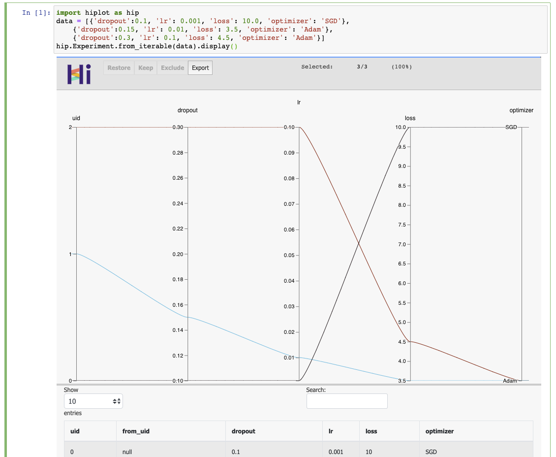
If you have a jupyter notebook, you can get started with something as simple as:

import hiplot as hip
data = [{'dropout':0.1, 'lr': 0.001, 'loss': 10.0, 'optimizer': 'SGD'},
        {'dropout':0.15, 'lr': 0.01, 'loss': 3.5, 'optimizer': 'Adam'},
        {'dropout':0.3, 'lr': 0.1, 'loss': 4.5, 'optimizer': 'Adam'}]
hip.Experiment.from_iterable(data).display()

See the live result

Result

Links

Citing

@misc{hiplot,
    author = {Haziza, D. and Rapin, J. and Synnaeve, G.},
    title = {{Hiplot, interactive high-dimensionality plots}},
    year = {2020},
    publisher = {GitHub},
    journal = {GitHub repository},
    howpublished = {\url{https://github.com/facebookresearch/hiplot}},
}

Credits

Inspired by and based on code from Kai Chang, Mike Bostock and Jason Davies.

External contributors (please add your name when you submit your first pull request):

License

HiPlot is MIT licensed, as found in the LICENSE file.

Comments
  • It's now possible to install via conda. Update README

    It's now possible to install via conda. Update README

    I created a conda-forge recipe and my PR is merged so you can install this package with conda link using

    conda install -c conda-forge hiplot
    

    You might consider to update the README accordingly.

    opened by rpanai 21
  • Displaying a lot of rows in Streamlit / Wasteful use of bandwidth

    Displaying a lot of rows in Streamlit / Wasteful use of bandwidth

    Streamlit currently has a hard limit of 50Mb for a single component. I have dataset that is only 16Mb of data as a .csv, but as HiPlot transfers that as JSON suddenly the data is over 200Mb. Transferring the data like that, every datapoint containsing all column names seems a rather wasteful use of bandwidth.

    Not only does it affect the Streamlit component, but also considerably slows down loading large datasets in the standalone HiPlot-application (assuming the data there is transferred the same way).

    My suggestion would be to transfer the column names as an array and the datapoints as arrays as well. On the client they then can be matched by position in the array.

    enhancement streamlit 
    opened by F1nnM 15
  • Allow users to hide 'uid' and 'from_uid' from the table

    Allow users to hide 'uid' and 'from_uid' from the table

    Hi @danthe3rd,

    Thanks for the nice library. Very lightweight, very useful :slightly_smiling_face:

    Background When I have a lot of axes on the parallel plot I always drop uid and from_uid axes, because they add some unnecessary clutter to the chart. I still want to keep these two axes in the table. In my case I have other axes than encode runs.

    Request Add an option (maybe to the display function) to not display uid and from_uid axes on the chart.

    Best, Kamil

    enhancement 
    opened by kamil-kaczmarek 15
  • [Windows] UnicodeDecodeError

    [Windows] UnicodeDecodeError

    Hello, i want to try the demo but i got this issue, i try to change render.py with encoding but it not works.

    i use

    • Python 3.7.4
    • conda 4.7.12

    `import hiplot as hip

    data = [{'dropout':0.1, 'lr': 0.001, 'loss': 10.0, 'optimizer': 'SGD'}, {'dropout':0.15, 'lr': 0.01, 'loss': 3.5, 'optimizer': 'Adam'}, {'dropout':0.3, 'lr': 0.1, 'loss': 4.5, 'optimizer': 'Adam'}] hip.Experiment.from_iterable(data).display()`

    UnicodeDecodeError: 'charmap' codec can't decode byte 0x9e in position 122350: character maps to <undefined>

    opened by yemregundogmus 13
  • Displaying

    Displaying "a lot of" columns in HiPlot.

    Hi,

    I have a datatset with 80 columns. Is there any way to configure HiPlot such that I get a horizontal scrollbar in order to go through all columns. Right now, the depiction tries to show all columns within the screensize, which makes the app unusable.

    Thank you, Martin

    enhancement 
    opened by MartinPyka 10
  • hiplot command not working on windows

    hiplot command not working on windows

    Hi,

    I installed hiplot on windows machine using poetry. I am not able to run the hiplot from command line in my python virtual environment.

    C:\Users\sarat.chinni\Codes_sequencing\hiplot>hiplot
    'hiplot' is not recognized as an internal or external command,
    operable program or batch file.
    

    I have added .py extension to hiplot function in my virtual environment Scripts folder then I got the following error:

    C:\Users\sarat.chinni\Codes_sequencing\hiplot>hiplot
    Traceback (most recent call last):
      File "C:\Users\sarat.chinni\Codes_sequencing\biobench\sandbox\Sarat\supervised_sequencing\.venv\Scripts\hiplot.py", line 6, in <module>
        sys.exit(hip.run_server_main())
    AttributeError: module 'hiplot' has no attribute 'run_server_main'
    

    How can I solve this issue on windows? (I am able to install and hiplot in my linux machine and it worked properly)

    Thank you

    bug windows 
    opened by saratbhargava 10
  • Support multi-objective study for `from_optuna`

    Support multi-objective study for `from_optuna`

    Hi, thank you for introducing the Optuna integration by #215!

    I suppose the current implementation does not support study whose objective function returns multiple objective values. More concretely, the following code:

    import optuna
    import hiplot as hip
    
    def objective(trial: "optuna.trial.Trial") -> float:
        x = trial.suggest_float("x", -1, 1)
        y = trial.suggest_float("y", -1, 1)    
    
        return x ** 2, y
    
    study = optuna.create_study(directions=["minimize"]*2)
    study.optimize(objective, n_trials=3)
    
    xp = hip.Experiment.from_optuna(study)
    

    The error message is as follows.

    RuntimeError                              Traceback (most recent call last)
    /var/folders/n3/7_7r1yrx6jsc_0780bvg02lr0000gn/T/ipykernel_82314/3836556673.py in <module>
          2 study.optimize(objective, n_trials=3)
          3 
    ----> 4 xp = hip.Experiment.from_optuna(study)
    
    ~/Documents/hiplot/hiplot/experiment.py in from_optuna(study)
        519         hyper_opt_data = []
        520         for each_trial in study.trials:
    --> 521             trial_params = {}
        522             trial_params["value"] = each_trial.value # name = value, as it could be RMSE / accuracy, or any value that the user selects for tuning
        523             trial_params["uid"] = each_trial.number
    
    /opt/homebrew/Caskroom/miniconda/base/envs/optuna39/lib/python3.9/site-packages/optuna/trial/_frozen.py in value(self)
        389         if self._values is not None:
        390             if len(self._values) > 1:
    --> 391                 raise RuntimeError(
        392                     "This attribute is not available during multi-objective optimization."
        393                 )
    
    RuntimeError: This attribute is not available during multi-objective optimization.
    

    Dependencies:

    • Optuna: 2.10.0
    • hiplot: https://github.com/facebookresearch/hiplot/tree/79b3d52a6842d6ba12f0a544e27a444562a486df

    To clarify it in the documentation, this PR mentions the supported study.

    By the way, to access the objective values of either single and multi-objective, we can use tiral.values that contains retuned value by the objective function of Optuna as list.

    CLA Signed 
    opened by nzw0301 8
  • NaN values don't show in categorical column

    NaN values don't show in categorical column

    Hi,

    I've come across a weird bug with the parallel plot: One of my float columns/axis contains NaN-values. When plotted with Hiplot only sometimes the entry "nan/inf/null" appears on the axis; more exactly it only appears if there are at least 6 unique values other than NaN in that column. For example, if all entries in that column contain only the values [nan 3. 5. 7. 9. 15. 30. ] the "nan/inf/null" entry shows correctly. If however I replace all 30's with 15's without changing anything else, the entry doesn't show up.

    Is that a bug, or am I overseeing something on my side?

    bug 
    opened by F1nnM 8
  • Streamlit: Export Button doesn't work

    Streamlit: Export Button doesn't work

    I use the Hiplot-Component in Streamlit. When I click the Export button nothing happens. No download starts, no error in the console, no log on the server.

    opened by F1nnM 7
  • Can't access off-screen columns in table when force_full_width=True

    Can't access off-screen columns in table when force_full_width=True

    When there are too many columns to display on the screen, there's no way to access the missing ones in the table. It would be helpful if displayed columns could be toggled off or resized, or if reordering the plot columns reordered the table.

    bug 
    opened by currivan 7
  • Streamlit component causes resets of entire page

    Streamlit component causes resets of entire page

    Hi again, I work with a large dataset in the Streamlit-component of HiPlot. Whenever I select something in the plot it turns gray, as it's waiting for Streamlit to run, which takes a couple of seconds due to the large dataset. When I repeatedly click around in the plot (firing updates), while it's still loading, at one point Streamlit resets the entire page and all inputs/selections are lost. That might happen after just three clicks or after 20, but it happens. It also happens when the plot is loading and I change other Streamlit inputs, so it might be a Streamlit issue, but I can't say that for sure and I was asked to also open this issue here.

    Streamlit issue: https://github.com/streamlit/streamlit/issues/2695

    streamlit 
    opened by F1nnM 6
  • Bump json5 from 2.1.3 to 2.2.2

    Bump json5 from 2.1.3 to 2.2.2

    Bumps json5 from 2.1.3 to 2.2.2.

    Release notes

    Sourced from json5's releases.

    v2.2.2

    • Fix: Properties with the name __proto__ are added to objects and arrays. (#199) This also fixes a prototype pollution vulnerability reported by Jonathan Gregson! (#295).

    v2.2.1

    • Fix: Removed dependence on minimist to patch CVE-2021-44906. (#266)

    v2.2.0

    • New: Accurate and documented TypeScript declarations are now included. There is no need to install @types/json5. (#236, #244)
    Changelog

    Sourced from json5's changelog.

    v2.2.2 [code, diff]

    • Fix: Properties with the name __proto__ are added to objects and arrays. (#199) This also fixes a prototype pollution vulnerability reported by Jonathan Gregson! (#295).

    v2.2.1 [code, diff]

    • Fix: Removed dependence on minimist to patch CVE-2021-44906. (#266)

    v2.2.0 [code, diff]

    • New: Accurate and documented TypeScript declarations are now included. There is no need to install @types/json5. (#236, #244)
    Commits
    • 14f8cb1 2.2.2
    • 10cc7ca docs: update CHANGELOG for v2.2.2
    • 7774c10 fix: add proto to objects and arrays
    • edde30a Readme: slight tweak to intro
    • 97286f8 Improve example in readme
    • d720b4f Improve readme (e.g. explain JSON5 better!) (#291)
    • 910ce25 docs: fix spelling of Aseem
    • 2aab4dd test: require tap as t in cli tests
    • 6d42686 test: remove mocha syntax from tests
    • 4798b9d docs: update installation and usage for modules
    • Additional commits viewable in compare view

    Dependabot compatibility score

    Dependabot will resolve any conflicts with this PR as long as you don't alter it yourself. You can also trigger a rebase manually by commenting @dependabot rebase.


    Dependabot commands and options

    You can trigger Dependabot actions by commenting on this PR:

    • @dependabot rebase will rebase this PR
    • @dependabot recreate will recreate this PR, overwriting any edits that have been made to it
    • @dependabot merge will merge this PR after your CI passes on it
    • @dependabot squash and merge will squash and merge this PR after your CI passes on it
    • @dependabot cancel merge will cancel a previously requested merge and block automerging
    • @dependabot reopen will reopen this PR if it is closed
    • @dependabot close will close this PR and stop Dependabot recreating it. You can achieve the same result by closing it manually
    • @dependabot ignore this major version will close this PR and stop Dependabot creating any more for this major version (unless you reopen the PR or upgrade to it yourself)
    • @dependabot ignore this minor version will close this PR and stop Dependabot creating any more for this minor version (unless you reopen the PR or upgrade to it yourself)
    • @dependabot ignore this dependency will close this PR and stop Dependabot creating any more for this dependency (unless you reopen the PR or upgrade to it yourself)
    • @dependabot use these labels will set the current labels as the default for future PRs for this repo and language
    • @dependabot use these reviewers will set the current reviewers as the default for future PRs for this repo and language
    • @dependabot use these assignees will set the current assignees as the default for future PRs for this repo and language
    • @dependabot use this milestone will set the current milestone as the default for future PRs for this repo and language

    You can disable automated security fix PRs for this repo from the Security Alerts page.

    CLA Signed dependencies javascript 
    opened by dependabot[bot] 0
  • Axis not displayed when loading CSV

    Axis not displayed when loading CSV

    When I upload the attached CSV onto the hosted version of HiPlot some axes of the CSV do not appear in the parallel plot, whereas they correctly appear in the table below. If I right-click on the table's headers I'm not offered to restore these axes onto the plot. These axes are "Ratio" and "Log(ratio)".

    Untitled spreadsheet - Sheet5.csv

    enhancement 
    opened by lw 4
  • Auto-ranking of most explicative features

    Auto-ranking of most explicative features

    Scenario: I have a grid-search on parameters A, B and C. For each sample, I have an associated loss which I try to minimize.

    I want to know which parameter (A, B or C) has the most influence on the loss automatically.

    In python: This can be done by learning a simple RandomForestRegressor (or Classifier depending on the target value type), and then calling permutation_importance to get an importance score for each parameter. For this to be embedded in HiPlot, it would need to be done in JS (for example with this library?)

    https://scikit-learn.org/stable/modules/generated/sklearn.ensemble.RandomForestRegressor.html https://scikit-learn.org/stable/modules/permutation_importance.html

    UI: This could be triggered by right-clicking a column. The result could be displayed by ordering the column by relative importance. Need a way to select which columns to include/exclude from the calculation, and to display the correlation score

    enhancement 
    opened by danthe3rd 0
  • Display bugs with rotated labels

    Display bugs with rotated labels

    Original change in https://github.com/facebookresearch/hiplot/pull/213 Workaround: Use version <= 0.1.28

    hi there. I've tried to track down which recent changes to hiplot resulted in my plots getting significantly harder to read, and narrowed it down to 0.1.28 -> 0.1.29 and believe this is the PR responsible.

    This perfectly readable and stacked display: Screen Shot 2021-10-24 at 12 56 37 PM turned into Screen Shot 2021-10-24 at 12 57 35 PM which cuts off the final column name if I make the window any more narrow and causes a weird spacing issue on the right-side.

    I very much support improving the visual interface of hiplot but I believe this hurt the overall experience. Would you be open to discussing some of the changes made here and perhaps a partial revert? Or am I best served maintaining a separate fork of the project? (I am not a front-end developer but am trying very hard to use hiplot in a tool I am building).

    The above screenshots were in Opera (I've noticed Safari has had existing trouble with dragging columns). I also noticed that on Safari, this same change resulted in "ghosting" of the headers upon scrolling (and did not fix the aforementioned problem): Screen Shot 2021-10-24 at 1 01 39 PM

    Screen Shot 2021-10-24 at 1 03 20 PM

    (that's the "rearranging" problem in safari I mentioned, the annotation divorces from the column)

    (original report in https://github.com/facebookresearch/hiplot/pull/214 from @mathematicalmichael )

    enhancement 
    opened by danthe3rd 11
  • Dash App

    Dash App

    This is an extremely cool pacakge, many research units that I have been working at are slowly switching from jupyter notebooks to dash type web-apps, would there be a way to get this into plolty dash? That would be an extremely exciting development.

    enhancement 
    opened by firmai 7
Releases(0.1.32)
Define fortify and autoplot functions to allow ggplot2 to handle some popular R packages.

ggfortify This package offers fortify and autoplot functions to allow automatic ggplot2 to visualize statistical result of popular R packages. Check o

Sinhrks 504 Dec 23, 2022
:art: Diagram as Code for prototyping cloud system architectures

Diagrams Diagram as Code. Diagrams lets you draw the cloud system architecture in Python code. It was born for prototyping a new system architecture d

MinJae Kwon 27.5k Dec 30, 2022
Massively parallel self-organizing maps: accelerate training on multicore CPUs, GPUs, and clusters

Somoclu Somoclu is a massively parallel implementation of self-organizing maps. It exploits multicore CPUs, it is able to rely on MPI for distributing

Peter Wittek 239 Nov 10, 2022
This is a Cross-Platform Plot Manager for Chia Plotting that is simple, easy-to-use, and reliable.

Swar's Chia Plot Manager A plot manager for Chia plotting: https://www.chia.net/ Development Version: v0.0.1 This is a cross-platform Chia Plot Manage

Swar Patel 1.3k Dec 13, 2022
LabGraph is a a Python-first framework used to build sophisticated research systems with real-time streaming, graph API, and parallelism.

LabGraph is a a Python-first framework used to build sophisticated research systems with real-time streaming, graph API, and parallelism.

MLH Fellowship 7 Oct 05, 2022
Bcc2telegraf: An integration that sends ebpf-based bcc histogram metrics to telegraf daemon

bcc2telegraf bcc2telegraf is an integration that sends ebpf-based bcc histogram

Peter Bobrov 2 Feb 17, 2022
nptsne is a numpy compatible python binary package that offers a number of APIs for fast tSNE calculation.

nptsne nptsne is a numpy compatible python binary package that offers a number of APIs for fast tSNE calculation and HSNE modelling. For more detail s

Biomedical Visual Analytics Unit LUMC - TU Delft 29 Jul 05, 2022
Design your own matplotlib stylefile interactively

Tired of playing with font sizes and other matplotlib parameters every time you start a new project or write a new plotting function? Want all you plots have the same style? Use matplotlib configurat

yobi byte 207 Dec 08, 2022
BrowZen correlates your emotional states with the web sites you visit to give you actionable insights about how you spend your time browsing the web.

BrowZen BrowZen correlates your emotional states with the web sites you visit to give you actionable insights about how you spend your time browsing t

Nick Bild 36 Sep 28, 2022
1900-2016 Olympic Data Analysis in Python by plotting different graphs

🔥 Olympics Data Analysis 🔥 In Data Science field, there is a big topic before creating a model for future prediction is Data Analysis. We can find o

Sayan Roy 1 Feb 06, 2022
OpenStats is a library built on top of streamlit that extracts data from the Github API and shows the main KPIs

Open Stats Discover and share the KPIs of your OpenSource project. OpenStats is a library built on top of streamlit that extracts data from the Github

Pere Miquel Brull 4 Apr 03, 2022
Generate knowledge graphs with interesting geometries, like lattices

Geometric Graphs Generate knowledge graphs with interesting geometries, like lattices. Works on Python 3.9+ because it uses cool new features. Get out

Charles Tapley Hoyt 5 Jan 03, 2022
Plotting library for IPython/Jupyter notebooks

bqplot 2-D plotting library for Project Jupyter Introduction bqplot is a 2-D visualization system for Jupyter, based on the constructs of the Grammar

3.4k Dec 29, 2022
Quickly and accurately render even the largest data.

Turn even the largest data into images, accurately Build Status Coverage Latest dev release Latest release Docs Support What is it? Datashader is a da

HoloViz 2.9k Dec 28, 2022
Visualization Library

CamViz Overview // Installation // Demos // License Overview CamViz is a visualization library developed by the TRI-ML team with the goal of providing

Toyota Research Institute - Machine Learning 67 Nov 24, 2022
Plotting data from the landroid and a raspberry pi zero to a influx-db

landroid-pi-influx Plotting data from the landroid and a raspberry pi zero to a influx-db Dependancies Hardware: Landroid WR130E Raspberry Pi Zero Wif

2 Oct 22, 2021
Shaded 😎 quantile plots

shadyquant 😎 This python package allows you to quantile and plot lines where you have multiple samples, typically for visualizing uncertainty. Your d

Mehrad Ansari 13 Sep 29, 2022
Data Visualization Guide for Presentations, Reports, and Dashboards

This is a highly practical and example-based guide on visually representing data in reports and dashboards.

Anton Zhiyanov 395 Dec 29, 2022
Tools for calculating and visualizing Elo-like ratings of MLB teams using Retosheet data

Overview This project uses historical baseball games data to calculate an Elo-like rating for MLB teams based on regular season match ups. The Elo rat

Lukas Owens 0 Aug 25, 2021
Smoking Simulation is an app to simulate the spreading of smokers and non-smokers, their interactions and population during certain amount of time.

Smoking Simulation is an app to simulate the spreading of smokers and non-smokers, their interactions and population during certain

Bohdan Ruban 5 Nov 08, 2022