view cool stats related to your discord account.

Overview

DiscoStats

cool statistics generated using your discord data.

image

How?

DiscoStats is not a service that breaks the Discord Terms of Service or Community Guidelines. Discord has an option to request data which is what this entire application is based upon. It just scans through the lines of text of every message you have ever sent and generates statistics based upon that. As a forewarning, you need to request your data to use the application, which could potentially take up to 30 days.

Installation

⚠️ make sure you have python 3.7+ installed.

  • Clone the repository:
git clone https://github.com/ibra/DiscoStats
  • Install the dependencies:
pip install -r requirements.txt
  • Move your discord data inside the project directory, make sure it is all dumped under one "package" folder.
  • run main file:
python main.py  
  • optionally use the --dir flag to pinpoint the package location to a specific directory:
python main.py --dir otherFolder/package
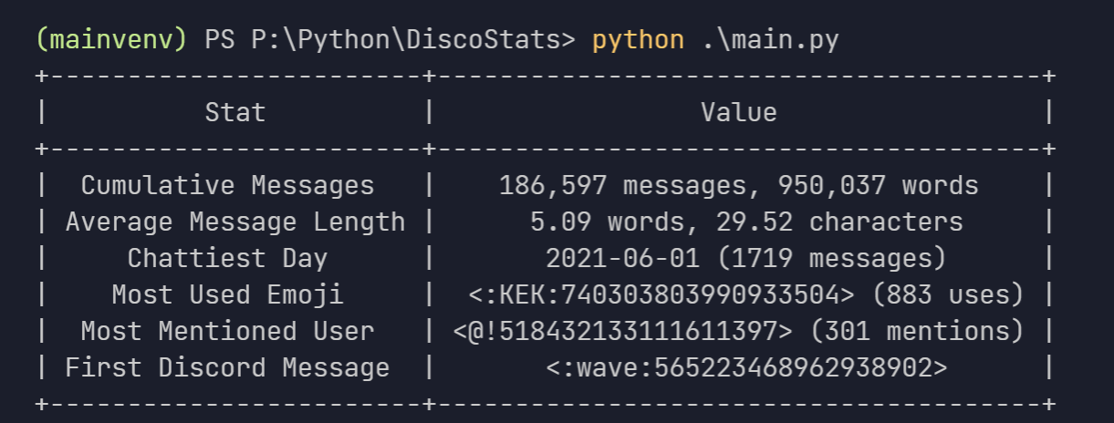
Known Limitations

  • the name of servers, channels, users etc. cannot be displayed as there is no way to do that without having a bot or some sort of authorization within the server itself
  • the names of the emojis alone cannot be used because there could be conflicts between different servers, so its more convenient for them to be displayed in the <:Emoji:12345678910> format.
Owner
ibrahim hisham
student, programmer & hobbyist indie game developer
ibrahim hisham
An interactive dashboard built with python that enables you to visualise how rent prices differ across Sweden.

sweden-rent-dashboard An interactive dashboard built with python that enables you to visualise how rent prices differ across Sweden. The dashboard/web

Rory Crean 5 Dec 19, 2021
在原神中使用围栏绘图

yuanshen_draw 在原神中使用围栏绘图 文件说明 toLines.py 将一张图片转换为对应的线条集合,视频可以按帧转换。 draw.py 在原神家园里绘制一张线条图。 draw_video.py 在原神家园里绘制视频(自动按帧摆放,截图(win)并回收) cat_to_video.py

14 Oct 08, 2022
Leyna's Visualizing Data With Python

Leyna's Visualizing Data Below is information on the number of bilingual students in three school districts in Massachusetts. You will also find infor

11 Oct 28, 2021
Complex heatmaps are efficient to visualize associations between different sources of data sets and reveal potential patterns.

Make Complex Heatmaps Complex heatmaps are efficient to visualize associations between different sources of data sets and reveal potential patterns. H

Zuguang Gu 973 Jan 09, 2023
Focus on Algorithm Design, Not on Data Wrangling

The dataTap Python library is the primary interface for using dataTap's rich data management tools. Create datasets, stream annotations, and analyze model performance all with one library.

Zensors 37 Nov 25, 2022
Ana's Portfolio

Ana's Portfolio ✌️ Welcome to my Portfolio! You will find here different Projects I have worked on (from scratch) 💪 Projects 💻 1️⃣ Hangman game (Mad

Ana Katherine Cortes Sobrino 9 Mar 15, 2022
web application for flight log analysis & review

Flight Review This is a web application for flight log analysis. It allows users to upload ULog flight logs, and analyze them through the browser. It

PX4 Drone Autopilot 145 Dec 20, 2022
visualize_ML is a python package made to visualize some of the steps involved while dealing with a Machine Learning problem

visualize_ML visualize_ML is a python package made to visualize some of the steps involved while dealing with a Machine Learning problem. It is build

Ayush Singh 164 Dec 12, 2022
Color maps for POV-Ray v3.7 from the Plasma, Inferno, Magma and Viridis color maps in Python's Matplotlib

POV-Ray-color-maps Color maps for POV-Ray v3.7 from the Plasma, Inferno, Magma and Viridis color maps in Python's Matplotlib. The include file Color_M

Tor Olav Kristensen 1 Apr 05, 2022
Create charts with Python in a very similar way to creating charts using Chart.js

Create charts with Python in a very similar way to creating charts using Chart.js. The charts created are fully configurable, interactive and modular and are displayed directly in the output of the t

Nicolas H 68 Dec 08, 2022
Profile and test to gain insights into the performance of your beautiful Python code

Profile and test to gain insights into the performance of your beautiful Python code View Demo - Report Bug - Request Feature QuickPotato in a nutshel

Joey Hendricks 138 Dec 06, 2022
A dashboard built using Plotly-Dash for interactive visualization of Dex-connected individuals across the country.

Dashboard For The DexConnect Platform of Dexterity Global Working prototype submission for internship at Dexterity Global Group. Dashboard for real ti

Yashasvi Misra 2 Jun 15, 2021
clock_plot provides a simple way to visualize timeseries data, mapping 24 hours onto the 360 degrees of a polar plot

clock_plot clock_plot provides a simple way to visualize timeseries data mapping 24 hours onto the 360 degrees of a polar plot. For usage, please see

12 Aug 24, 2022
Altair extension for saving charts in a variety of formats.

Altair Saver This packge provides extensions to Altair for saving charts to a variety of output types. Supported output formats are: .json/.vl.json: V

Altair 85 Dec 09, 2022
A simple code for plotting figure, colorbar, and cropping with python

Python Plotting Tools This repository provides a python code to generate figures (e.g., curves and barcharts) that can be used in the paper to show th

Guanying Chen 134 Jan 02, 2023
A Graph Learning library for Humans

A Graph Learning library for Humans These novel algorithms include but are not limited to: A graph construction and graph searching class can be found

Richard Tjörnhammar 1 Feb 08, 2022
Smoking Simulation is an app to simulate the spreading of smokers and non-smokers, their interactions and population during certain amount of time.

Smoking Simulation is an app to simulate the spreading of smokers and non-smokers, their interactions and population during certain

Bohdan Ruban 5 Nov 08, 2022
Data science project for exploratory analysis on the kcse grades dataset (Kamilimu Data Science Track)

Kcse-Data-Analysis Data science project for exploratory analysis on the kcse grades dataset (Kamilimu Data Science Track) Findings The performance of

MUGO BRIAN 1 Feb 23, 2022
:bowtie: Create a dashboard with python!

Installation | Documentation | Gitter Chat | Google Group Bowtie Introduction Bowtie is a library for writing dashboards in Python. No need to know we

Jacques Kvam 753 Dec 22, 2022
Create SVG drawings from vector geodata files (SHP, geojson, etc).

SVGIS Create SVG drawings from vector geodata files (SHP, geojson, etc). SVGIS is great for: creating small multiples, combining lots of datasets in a

Neil Freeman 78 Dec 09, 2022